


Evergreen playbook
Mobile-First Indexing: The Complete Audit and Recovery Playbook
Google has crawled and ranked on the mobile version of your pages since mobile-first indexing completed its rollout in October 2023. Most sites still leak rankings through the same handful of parity gaps, quietly, between named algorithm updates rather than because of them. This is the audit that finds and fixes those gaps — the mechanism-level checklist, not a reaction to whatever update is in the news this week.
- Mobile-first indexing completed its rollout in October 2023. Google indexes and ranks primarily on the mobile-rendered version of your page, full stop.
- Most ranking loss that gets blamed on “an update” is really a content-parity or Core Web Vitals gap that had been building for months, invisible until a broad re-ranking exposes it.
- The six most common parity leaks — hidden accordion content, mobile-only nav that drops links, missing schema, thinner image sets, shortened titles, and weak mobile Core Web Vitals — are covered below, in the order to check them.
- Interaction to Next Paint (INP) replaced First Input Delay (FID) as a Core Web Vital in March 2024. Mobile INP is now the responsiveness benchmark that matters.
- Google also runs continuous, unannounced ranking-system tuning outside of its named updates, so unexplained volatility on any given date is more often one of those routine changes than a new named event.
- This audit works regardless of which update — named, unnamed, confirmed, or rumored — is behind any given dip. If you’re here because of a specific update, the current update timeline lives in a separate, regularly refreshed tracker — this page stays focused on the mechanism, which doesn’t change month to month.
Most mobile-first indexing problems don’t arrive with a headline. They arrive as a slow bleed in impressions over a few months, and by the time someone notices, it’s tempting to blame whatever named update happens to line up with the timing. The more useful — and more common — explanation is structural: your mobile page is quietly thinner than your desktop page, and Google has been ranking off the thinner one the whole time. That’s the problem this playbook is built to find and fix, independent of any single update.
What mobile-first indexing actually is
Strip away the update speculation and the underlying mechanism hasn’t moved much. Google’s own crawling and indexing documentation still describes the same core rule it’s used since the rollout finished in October 2023: Google indexes and ranks primarily on the mobile version of your page, crawled with a smartphone user agent. If your mobile page has less content, fewer internal links, thinner structured data, or lower-quality images than your desktop page, Google is working from the weaker version — not “also considering” the stronger desktop one as a backup.
That single fact is still the most common way sites quietly lose ground without ever seeing an update in the news. Nobody announces “your mobile FAQ accordion hides half your content from the crawler” — you just watch impressions erode over a few months and blame the next named update that happens to line up with the timing.
| Signal | Where Google gets it | Common parity gap |
|---|---|---|
| Primary content | Rendered mobile HTML | Tabs/accordions that lazy-load or omit content on mobile |
| Titles & headings | Mobile DOM | Shortened mobile-only titles losing target keywords |
| Internal links | Mobile nav/footer/in-content links | Hamburger menus that drop deep links present on desktop |
| Structured data | Mobile page markup | Schema only injected on the desktop template |
| Images & alt text | Mobile image URLs and markup | Different, smaller image set served to save bandwidth |
| Core Web Vitals | Real-user mobile Chrome data (CrUX) + lab data | Third-party scripts that only bog down mobile viewports |
The mobile-first audit
This is the version of “what to do” that works regardless of what’s showing up on ranking-volatility trackers this week, because it’s just good practice against the indexing mechanism itself — run it quarterly, not just when something feels off.
1. Confirm parity before you diagnose anything
- Pull a live mobile render via Search Console > URL Inspection > View Crawled Page. Compare the rendered HTML line-by-line against the desktop source for your top 20 landing pages. Look for missing paragraphs, trimmed product descriptions, or FAQ sections that exist in desktop source but not in the mobile render.
- Run the same URLs through Google’s Rich Results Test using the mobile user-agent toggle. Verify that Article, FAQPage, HowTo, Product, and BreadcrumbList schema are present and identical to the desktop version. If schema is injected via JavaScript, confirm it fires in the mobile render, not just desktop.
- Use Screaming Frog (or Sitebulb) with the user-agent set to
Mozilla/5.0 (Linux; Android 10; K) AppleWebKit/537.36 (KHTML, like Gecko) Chrome/127.0.0.0 Mobile Safari/537.36and viewport set to 360×640. Crawl your top 200 pages and export the “Rendered HTML” view. Diff this against a desktop crawl to spot missing content blocks. - Check whether accordions, tabs, or “read more” toggles hide text from the initial DOM on mobile rather than just visually collapsing it. If the content is absent from the rendered HTML until a click event, Google may not index it. Use
display:noneorvisibility:hiddensparingly for critical content; preferheight:0;overflow:hiddenwith an ARIA toggle if you must hide it visually, but keep it in the DOM. - Compare internal link counts between the mobile nav/footer and the desktop equivalents — hamburger menus are the single most common place links quietly disappear. Count hrefs in the rendered mobile HTML vs. desktop HTML for the same page. A drop of more than 15–20% is a red flag.
Mozilla/5.0 (Linux; Android 10; K) AppleWebKit/537.36 (KHTML, like Gecko) Chrome/W.X.Y.Z Mobile Safari/537.36 (compatible; Googlebot/2.1; +http://www.google.com/bot.html). If you use dynamic serving, the Vary: User-Agent header is mandatory.2. Separate real ranking loss from reporting noise
- Check Google’s Search Status Dashboard first, every time. If there’s no logged incident for your date range, you’re not analyzing a named update — you’re analyzing something else (seasonality, a SERP feature change, a tracking bug, a site issue).
- Compare Search Console clicks and impressions for the same weekday ranges before and after any date you suspect, not raw week-over-week, to avoid weekday traffic-pattern noise. Use 28-day or 91-day ranges for cleaner statistical baselines.
- Segment by device in Search Console. A drop that’s mobile-only points you straight back to parity and Core Web Vitals rather than generic content quality. If desktop is stable while mobile drops, you have a mobile-specific problem, not a broad quality update.
- Don’t assume two nearby volatility events share a cause. In October 2023, Google clarified on its blog that unconfirmed fluctuations reported by the SEO community can be unrelated to subsequent confirmed updates — match dates to the dashboard’s actual incident window before drawing a line between them.
3. Fix the mobile-specific things that actually move the needle
- Run PageSpeed Insights on mobile specifically — it pulls real Chrome User Experience Report (CrUX) data alongside lab results, which desktop scores won’t show you. Look at the “Origin” tab in CrUX to see if your whole domain is failing INP or LCP on mobile.
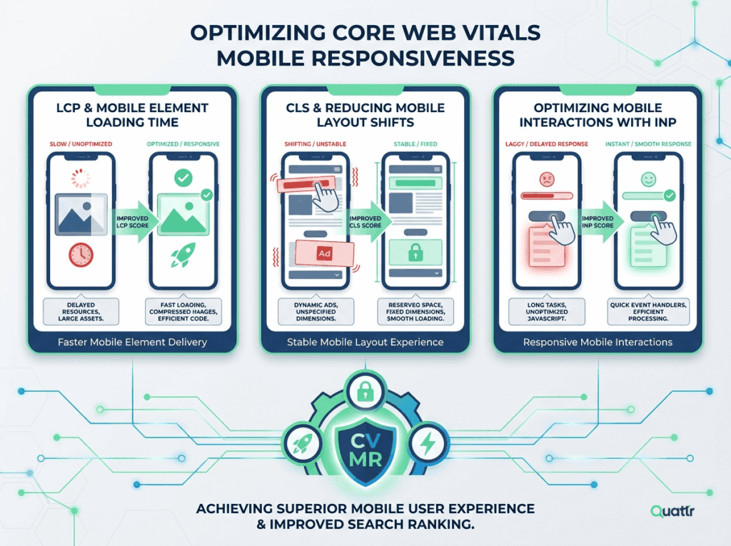
- Prioritize Interaction to Next Paint (INP) fixes on any page with heavy third-party scripts (chat widgets, ad tags, consent managers, A/B testing frameworks) — these disproportionately hurt mobile. INP officially replaced First Input Delay (FID) as a Core Web Vital in March 2024. A mobile INP above 200 ms needs attention; above 500 ms is a severe user-experience penalty.
- Audit your Largest Contentful Paint (LCP) on mobile. Hero images served via
srcsetshould not load a 1600 px wide asset into a 360 px viewport. Use responsive images withsizesattributes, and preload the mobile LCP candidate with<link rel="preload" as="image" imagesrcset="..." imagesizes="...">where appropriate. - Re-test Cumulative Layout Shift (CLS) after any redesign that changes how ads, images, or embedded widgets load on narrow viewports. Reserve space with min-height containers for dynamic content (ad slots, cookie banners, recommendation widgets) so the page doesn’t jump when they inject.
- If you serve dynamic content by device, verify the
Vary: User-AgentHTTP header is set correctly so Google (and CDNs) don’t cache the wrong version. If you use a CDN like Cloudflare or Fastly, ensure your cache key includes the user-agent variant, or you risk serving desktop markup to Googlebot smartphone.
<head>, try deferring it or splitting the parsing into requestIdleCallback chunks. Test with Chrome DevTools > Performance > “Interactions” track.Tools to run this audit at scale
Below is the exact tool stack that makes this playbook practical for sites with more than a few dozen pages. You don’t need all of them, but you need at least one crawler and one speed tool.
Search Console — URL Inspection
Free. Use “View Crawled Page” to see the exact HTML Googlebot smartphone rendered. Export it and diff against desktop.
Screaming Frog
Paid. Set user-agent to Googlebot smartphone, enable JavaScript rendering, and compare “Rendered HTML” vs. “Response HTML” to find JS-dependent content gaps.
PageSpeed Insights + CrUX
Free. Always test mobile first. The “Origin” view shows domain-wide mobile CWV trends from real Chrome users, not just lab data.
Rich Results Test
Free. Toggle between mobile and desktop user agents. Catches schema that only renders on one device type due to template branching.
WebPageTest
Free. Run on a real Moto G4 or mid-tier Android device preset. Enables filmstrip comparison of mobile vs. desktop visual progress and layout shift.
Chrome DevTools — Device Mode
Free. Use 360×640 or 390×844 viewport, 4× CPU throttling, and “Slow 4G” network to approximate how Googlebot smartphone experiences your page.
When not to act
The most honest thing this article can tell you is when to do nothing. If your rankings dip for a few days with no Search Status Dashboard entry, no device-specific pattern in Search Console, and no site change you made recently, the correct move is to wait. Google’s own core update guidance is blunt about this: a negative ranking impact doesn’t automatically mean something is wrong with your pages, and there’s no specific action to take to “recover” from ordinary volatility. Chasing every SERP fluctuation with structural changes is how sites end up making their mobile experience worse trying to fix a problem that was never there.
The audit above doesn’t change month to month, but Google’s update calendar does. The current confirmed-update timeline — including which recent volatility reports are and aren’t connected to a named update — lives in a separate tracker we refresh as the dashboard changes.
Where mobile fits into Google’s broader quality signals
Core Web Vitals — measured from mobile Chrome usage data first — remain part of the page experience signals Google has confirmed factor into ranking. Sites with weak mobile Interaction to Next Paint or Cumulative Layout Shift scores don’t get a separate “mobile penalty” line item, but they do enter every broad quality re-evaluation carrying a real UX handicap that compounds with any content-quality gaps a wider update also catches.
That’s the throughline worth remembering: mobile-first indexing itself is stable and well-documented since its October 2023 completion; what varies is how often the rest of Google’s ranking systems re-check the parity and performance gaps this audit is built to close. A page with perfect desktop content and broken mobile parity is still a broken page in Google’s index. Run this audit quarterly. Document your baselines. Fix parity before you chase updates.
Frequently asked questions
Does mobile-first indexing mean my desktop site doesn’t matter anymore?
No. Desktop pages are still crawled and still matter for desktop-specific ranking and for users who search from desktop. What changes is which version Google uses as the primary source for indexing and most ranking signals — that’s the mobile render, not the desktop one. If your desktop site has content or links that the mobile version lacks, Google is indexing the weaker of the two.
What’s the single most common mobile-first indexing mistake?
Content or links that exist on desktop but are trimmed, hidden, or lazy-loaded out of the initial mobile render — often for a “cleaner” mobile UI. Google evaluates what’s actually present in the mobile-rendered HTML, not the intent behind a responsive design choice. The second most common is schema injected only on the desktop template because the mobile template was built separately and never got the JSON-LD block ported over.
Do Core Web Vitals directly cause ranking drops?
Google has confirmed page experience signals, including Core Web Vitals, are part of ranking, but they’re one signal among many and are generally described as a tie-breaker among otherwise similarly relevant results rather than a dominant factor on their own. Poor mobile Vitals won’t sink genuinely strong content, but they remove a cushion you may need during a broad quality re-evaluation. In competitive SERPs, a 200 ms INP difference can be the tie-breaker.
Should I change my site the moment I see ranking volatility?
Not immediately. Confirm there’s a logged incident on the Search Status Dashboard, wait for the rollout to complete, then compare like-for-like date ranges. Reactive changes made mid-rollout are difficult to evaluate because you can’t isolate their effect from the update itself — and nearby volatility events can turn out to be unrelated entirely, even when the timing looks suspicious. Wait 7–14 days after a confirmed update finishes before making structural changes.
Are responsive design, dynamic serving, and separate mobile URLs all still supported?
Yes, Google supports all three technical approaches to mobile sites, but explicitly recommends responsive design as the default, since it serves one URL and one HTML payload to every device, which sidesteps most parity mistakes by construction. If you use dynamic serving, the Vary: User-Agent header is non-negotiable. If you use separate mobile URLs (m.example.com), ensure bidirectional rel="canonical" and rel="alternate" annotations are present and self-referencing correctly.
Does Google Discover use the same mobile-first evaluation?
Discover draws on many of the same quality and content signals as core search, and mobile UX quality (Discover is a mobile-only surface) is directly relevant there — a page with mobile parity or Core Web Vitals problems is working against itself in Discover specifically, not just in web search. Because Discover is exclusively mobile, parity gaps that only affect your mobile render are even more damaging there than in standard web search.
How do I know if Googlebot is actually seeing my mobile content correctly?
Use Search Console’s URL Inspection tool. Enter a URL, click “View Crawled Page,” then click “More info” and “HTML” to see the exact rendered HTML Googlebot smartphone received. If your critical content, images, or links appear there, Google can index them. If they don’t, but they appear in your browser’s mobile view, you likely have a rendering issue — often caused by overly aggressive lazy-loading, bot-specific blocking, or a CDN serving different markup to crawlers.
What changed with INP replacing FID in March 2024?
First Input Delay (FID) only measured the delay before the browser could begin processing a user’s first interaction. Interaction to Next Paint (INP) measures the full latency from interaction until the next frame is painted on screen, capturing JavaScript execution, layout, and paint time. This makes INP a much stricter metric, especially on mobile pages with heavy third-party scripts. If you optimized for FID but haven’t revisited your mobile interactions since early 2024, you may now be failing CWV without realizing it.
Sources and further reading
- Google Search Central — Mobile-first Indexing Best Practices
- Google Search Central Blog — Mobile-first indexing is coming to some sites that are ready (October 2023 completion announcement)
- Google Search Central — Google Search’s Core Updates
- Google Search Central — Updates to the Search Status Dashboard
- Google Search Central — Core Web Vitals
- Google Search Status Dashboard — status.search.google.com
- web.dev — Interaction to Next Paint (INP)